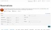
after git update (just now), filter display has changed.

skyrun

Active Member
was a grey background with rows, now all white.

i display in 2 columns, was displayed with fields down left column, then down right column.

so
1 5
2 6
3 7
4

now is displayed:
1 2
3 4
5 6
7

which will be very confusing to my users.

pretty sure all that changed with a gitub update (which i haven't done in a few weeks probably).

looks related to this perhaps:
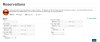
cheesegrits
about 24 hours ago

Added fabrik-filters-bootstrap, which is used when filter columns is set > 1

the old filter display was responsive. so worked well for me. can i select something to go back to how it was? thanks.
 
Well, first thing is we're keeping the new grid layout. The old one with tables was just a horrible hack, for a lot of reasons.

You can override the new layout if you want, tweak it to do what you need. Usual layout override locations apply.

Although as I didn't realize the old one did it that way, I may tweak the new one so it retains the same ordering for backward compat. Should be an interesting challenge.

-- hugh
 
OK, as of this commit:

https://github.com/Fabrik/fabrik/commit/fe53f365f377adf0a9488b0a70181a6ca786d9a3

... it pivots. Or doesn't pivot, I dunno. But it should behave like it did before. I've added an ArrayHelper::chunk(), which supports flipping the rows and cols round when chunking an array. Chunk pivoting?

For the curious, PHP has a very useful function called array_chunk(), which takes a flat array, and chunks it up into X arrays of size N. Useful for things like this - taking a flat array of filters, and transforming them into an array (rows) of arrays (cols) of filters, making building the Bootstrap grid a zillion times easier. But without intervention, that's going to chunk it into (1,2),(3,4)(5,6) etc. The new helper is a way to pivot that to (1,4),(2,5),(3,6), for any size of array and col count.

-- hugh
 
At some point I guess I might add YAFO to the list filter options, for "Grid Pivot" or some such, whichc ontrols whether it pivots or not.

-- hugh
 
it would be very nice to have the default be the same as it was, then you don't need the other options, but knowing how you did it, sounds like that would be hard.

for a 2 column one, list every other one in the first column

then another challenge is what to do when it's responsive. it would need to collapse to all of col 1 (in a div), then all of col 2 (in a div), to retain the same order as the columns of the list in both 2 column and 1 column config (which is how the table worked).
 
With the change I just committed, it should now be working the way it used to, the way you expect it to.

I'm not going to be expending any effort trying to get any new responsive behavior to match whatever happened with the old way, as that code was never designed to be responsive, it was a set of nested tables, that happened to be inside a span6 div, at the mercy of whatever the browser decided to do to it. So trying to get an actual fluid, responsive grid system to behave the way that did would be an exercise in futility. So for the moment at least, it'll do what it does, and that's the way it works.

The way to go might be to allow optional sizing, for the (not quite) standard small, medium and large viewports. I'm finally putting some effort into improving our grid handling, including building a responsive list layout, and will need to come up with a standard way in a variety of places for specifying grid columns for different sizings. The simplest would be allowing up to 3 comma separated values (4,2,1) for Large, Medium and Small. If less than that are provided, it defaults to the previous size, so 4 would be 4,4,4, and 4,2 would be 4,2,2.

And of course whatever I come up with has to work for Bootstrap 2, 3 and 4, and UIKit. And of course UIKit is a major pain in the ass because it's based on a 10 columns grid, not a 12, so none of the math built in to figure bootstrap row sizing, so all our hard code ...

$spanSize = floor(12 / $d->cols);

... works properly in UIKit, and really I need to go through the code and replace 12 with a call to a layout that just returns the base number.

Anyway. It's all kind of mind bending, but I'm getting a handle on it. Although of course I can guarrantee that the moment I finally figure it all out, J! will decide to dump Bootstrap and move on to something else. Although most UI frameworks no work with a grid system that more or less works the same, so ...

-- hugh
 
i appreciate you working on it. it doesn't seem to be working entirely yet though. it's duplicating some and not including all.

i included what it used to look like so you can see the columns in the filter.

and a screenshot currently too.
the ones on the left are right, but the ones on the right are not.

frankly though, not sure it's tremendously useful though if they get mixed up when they are collapsed responsively. making it narrower to display one column is now like shuffling cards where every other one is out of place (according to the way it was).

i think from that standpoint it would be less confusing to put it back to the way you had it originally. i'll just have to stop using 2 columns on filters. could be just what i'm used to, but the new multi-column options for displaying filter don't seem intuitive at all to me.

this is built in a template right, could i use the old filter-building code from the old template to create one that works for me? or could you just include the old template as an option?
 

Attachments

  • oldfilter.JPG
    oldfilter.JPG
    141.3 KB · Views: 59
  • post fix.JPG
    post fix.JPG
    106.1 KB · Views: 53
What site template are you using?

I'm currently using Helix 3, working on the BS3 stuff, and it looks a lot nicer ...

2017-11-23_0303.png

... and with Protostar ...

2017-11-23_0306.png

I'm about to look at adding a little styling, like borders, shading.

-- hugh
 
i use yootheme templates for my site.
i was wondering whether i would use a fabrik list template that would display the filters the old/table way for user ease/satisfaction. they work really well responsively in my use-cases and we have them on alot of forms.
 
I assume you can take the old fabrik-filters.php and use this for overriding fabrik-filters-bootstrap.php;)
and yes, it should really be backward compatible without having to override all existing Joomla or (custom) Fabrik templates

@cheesegrits :
is row-fluid and spanX doing in Bootstrap3 templates?
 
i see both files are still there. to switch over, i would have to update a template right? i don't see where that file is included offhand, but i'll keep looking.

i don't really know about the doing in part. the important thing to me is that they still work on my server and work really well across devices ;-)

yoo switched over to a new design about 6 months ago from their older 'warp 7' framework to a 'pro' framework, so newer yootheme templates probably use the newer techniques (but i'm not sure). at some point we will probably switch over.

thanks for giving me something to try to get the old filter display order back. i'll give it a try and let you know if it works.

PS: I would love the chance to give you and robbie a teamviewer demo of our 'skytrax' and 'skyforce' systems that we use for our franchised business SkyRun Vacation Rentals. I'm not sure how many fabrik applications there are that completely support a $15M business. we have over 200 lists and forms and over 3000 elements.
 
I assume you can take the old fabrik-filters.php and use this for overriding fabrik-filters-bootstrap.php;)
and yes, it should really be backward compatible without having to override all existing Joomla or (custom) Fabrik templates

@cheesegrits :
is row-fluid and spanX doing in Bootstrap3 templates?
It should be using the bs3 classes like col-md-3 etc in bs3 templates, as long as you updated the alt-layouts. I committed some changes to the bs3 layouts.

And yes, if you just copy the original fabrik-filters.php to fabrik-filters-bootstrap.php in the usual site template override location, it'll behave as before.


Sent from my HTC6545LVW using Tapatalk
 
that got me back to where i needed to be. thanks.

i'll have to figure out how to copy that file every time i update from git. AFO for which filter template file to use on fabrik options would be excellent to allow user custom styling.

note that i think the 2 column -bootstrap.php file you are shipping/on git still has column repeat issues mentioned above that were created trying to make the columns show as they used to (which only worked when not responsively wider, so i would revert those changes anyway...)
 
We are in need of some funding.
More details.

Thank you.

Members online

Back
Top