-
New Commercial Services Section
We have now opened a commercial services section here on the forum for registered users. If you have a Fabrik project that you wish to have someone work on for you, post it under Help Wanted. If you are an application developer and wish to earn some money helping others, post your details under Fabrik Application Developers.
Both of these are unmoderated. It will be up to both parties to work out the details and come to an agreement.
-
Joomla 5.1
For running J!5.1 you must https://fabrikar.com/forums/index.php?wiki/update-from-github/ or include the new file manually https://fabrikar.com/forums/index.php?threads/joomla-5-1-and-fabrik-cannot-find-files-error.54473/post-285151 See also Announcements
Nvd3 Chart visualization
- Views Views: 33,805
- Last updated Last updated:
-
Introduction
The nvd3 chart is a horizontal or vertical bar chart.
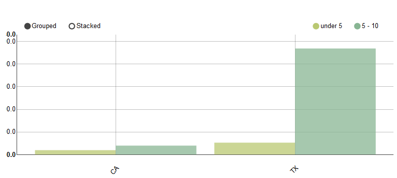
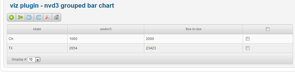
Say we have a Fabrik list with the following data, and we want to create a chart which shows the number of children in each state by age range. The field names are state, under5 and five_ten.
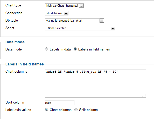
Add a new visualization and select 'nv3d_chart' as the visualization.
You then want to select the following Options:
and you will end up with a chart which looks like this:
To swap over the state and ages, to obtain the following chart, set 'Label axis values' to 'Split column':
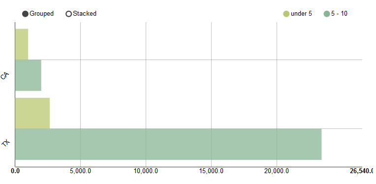
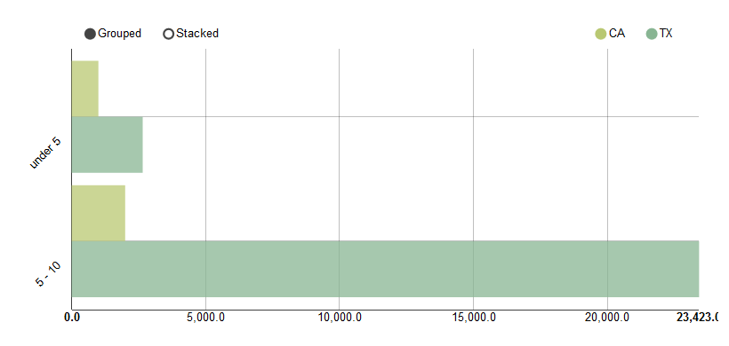
To swap the axis so that the values are on the Y axis change the chart from 'multi bar chart - horizontal' to 'multi bar chart'.
Also set the margin's property to something like '20,20,100,20' to give the x axis labels more space under the chart (otherwise they are truncated)
The new chart will look like this: