-
New Commercial Services Section
We have now opened a commercial services section here on the forum for registered users. If you have a Fabrik project that you wish to have someone work on for you, post it under Help Wanted. If you are an application developer and wish to earn some money helping others, post your details under Fabrik Application Developers.
Both of these are unmoderated. It will be up to both parties to work out the details and come to an agreement.
-
Joomla 5.1
For running J!5.1 you must https://fabrikar.com/forums/index.php?wiki/update-from-github/ or include the new file manually https://fabrikar.com/forums/index.php?threads/joomla-5-1-and-fabrik-cannot-find-files-error.54473/post-285151 See also Announcements
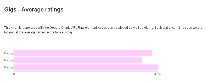
Google Chart visualization(deprecated)
- Views Views: 17,790
- Last updated Last updated:
-
The chart visualization uses Google's charting api to render charts
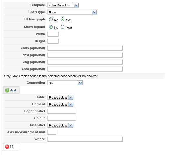
- Template - The template to use to display the chart. Templates can be found in components/com_fabrik/plugins/Visualizations/chart/views/chart/tmpl
- Chart type - The chart type you want to render
- Single Line Chart
- Multi Line Chart
- Sparkline
- Horizontal Bar Chart
- Vertical Bar Chart
- Horizontal Bar Chart (Grouped)
- Vertical Bar Chart (Grouped)
- Pie chart
- 3D Pie chart
- Scatter plot
- Fill line graph - Should the line graphs be filled or shown as a single line?
- Show legend - Should the legend be shown?
- Width - The width in pixels of the chart
- Height - The height in pixels of the chart
- chds - overrides the default chart data size - enter the min and max values required separated by a comma. If no data entered then the data passed to the chart's min and max values are used. E.g. 0, 50
- chxl - Enter some custom axis labels, e.g. 0,10,20,30,40,50. If nothing entered then only the min and max labels are shown
- chg - Add grid lines to the chart - e.g. 10,0,3,3 will add a dashed (3x3) grid every ten units on the x-axis only
- chm - add specific data point labels to your form, see http://code.google.com/apis/chart/labels.html#data_point_labels for the full explanation
- Connection - Connect up some of your existing Fabrik tables to the chart by selecting the Fabrik connection in which they will be found
- Table - The fabrik table whose data you want to display in the chart
- Element - The element that contains the data to chart - if you have calculations applied to any Elements these will also be listed here. You can't mix calculations and element data in the same chart.
- Legend label - A descriptive label of the data
- Colour - A hex colour (e.g. #00ff00) to use when rendering the graph
- Axis label - The element whose data will be shown on the data axis
- Axis measurement unit - E.g. 'cm', '%'
- Where - add an optional where statement to filter the data set to be plotted to the graph - e.g. 'name="rob"' (don't include the outer quotes)