
alastairwalker
Member
My setup is as follows:
Joomla! version: 3.3.6
Fabrik: 3.2 (i.e. last full release)
Template: Protostar (standard with J! 3.3.6)
URL used for responsiveness testing: www. responsivetest.net
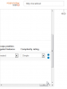
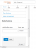
Nature of the problem: When a group is set up as a 'Repeating Group'; Template: Table; Layout: 4 columns
I would expect the tabular format to reduce to single column format as the smart device width is reduced to 3.5" format.
This is does not happen. The table remains at full column width, and the horizontal scroll bar shows this.
(See images 1 and 2).
Point of comparison: If the 'Repeating Group' is disabled, and say 4 columns are listed (for an 8 column table), as the smart device size shrinks, the column display reduces to single column format. This is the correct responsiveness behaviour.
Question: Am I expecting too much from the responsiveness for the 'Repeating Group' in the active state?
Any feedback will be greatly appreciated.
Alastair
Joomla! version: 3.3.6
Fabrik: 3.2 (i.e. last full release)
Template: Protostar (standard with J! 3.3.6)
URL used for responsiveness testing: www. responsivetest.net
Nature of the problem: When a group is set up as a 'Repeating Group'; Template: Table; Layout: 4 columns
I would expect the tabular format to reduce to single column format as the smart device width is reduced to 3.5" format.
This is does not happen. The table remains at full column width, and the horizontal scroll bar shows this.
(See images 1 and 2).
Point of comparison: If the 'Repeating Group' is disabled, and say 4 columns are listed (for an 8 column table), as the smart device size shrinks, the column display reduces to single column format. This is the correct responsiveness behaviour.
Question: Am I expecting too much from the responsiveness for the 'Repeating Group' in the active state?
Any feedback will be greatly appreciated.
Alastair