• Hello Fabrik Community

    Fabrik is now in the hands of the development team that brought you Fabrik for Joomla 4. We have recently transitioned the Fabrik site over to a new server and are busy trying to clean it up. We have upgraded the site to Joomla 4 and are running the latest version of Fabrik 4. We have also upgraded the Xenforo forum software to the latest version. Many of the widgets you might have been used to on the forum are no longer operational, many abandoned by the developers. We hope to bring back some of the important ones as we have time.

    Exciting times to be sure.

    The Fabrik 4.0 Official release is now available. In addition, the Fabrik codebase is now available in a public repository. See the notices about these in the announcements section

    We wish to shout out a very big Thank You to all of you who have made donations. They have really helped. But we can always use more...wink..wink..

    Also a big Thank You to those of you who have been assisting others in the forum. This takes a very big burden off of us as we work on bugs, the website and the future of Fabrik.

Nvd3 Chart visualization

  • Views Views: 33,739
  • Last updated Last updated:
  • Introduction​


    The nvd3 chart is a horizontal or vertical bar chart.

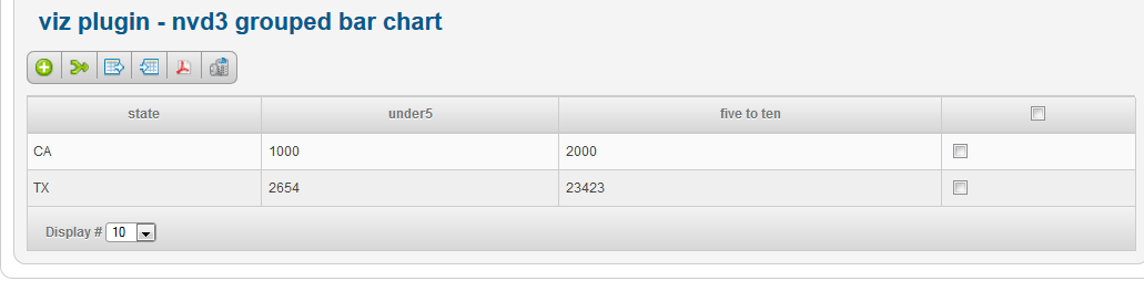
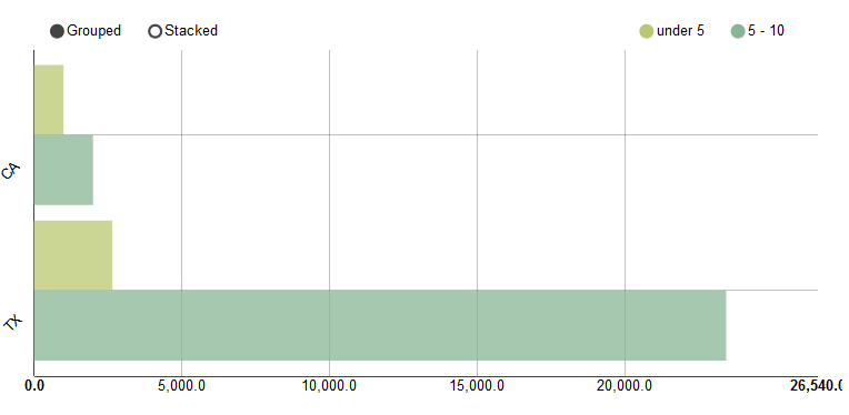
    Say we have a Fabrik list with the following data, and we want to create a chart which shows the number of children in each state by age range. The field names are state, under5 and five_ten.

    Nv3d-mutlibar-data.png


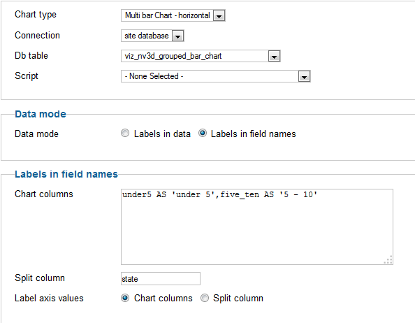
    Add a new visualization and select 'nv3d_chart' as the visualization.

    You then want to select the following Options:

    Nv3d-mutlibar-settings.png


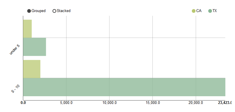
    and you will end up with a chart which looks like this:
    Nv3d-mutlibar-chart.png


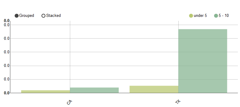
    To swap over the state and ages, to obtain the following chart, set 'Label axis values' to 'Split column':

    Nv3d-mutlibar-chart-split-labels.png


    To swap the axis so that the values are on the Y axis change the chart from 'multi bar chart - horizontal' to 'multi bar chart'.

    Also set the margin's property to something like '20,20,100,20' to give the x axis labels more space under the chart (otherwise they are truncated)

    The new chart will look like this:

    Nv3d-mutlibar-chart-split-labels_vert.png
Back
Top