
-
Payment Plugins Poll
We need your feedback on the need for updated payment plugins. Please go here and give us your feedback.
-
Joomla 5.1
For running J!5.1 you must install Fabrik 4.1 See also Announcements
-
Subscription and download (Fabrik 4.1 for J!4.2+ and J!5.1) are working now
See Announcement
Please post subscription questions and issues hereWe have resolved the issue with the J! updater and this will be fixed in the next release.
Elements
- Views Views: 96,173
- Last updated Last updated:
-
Sub-pages:
Contents
[what do the plus signs mean??]
Elements are the individual fields present on a form and the column names in your database table.
There are dozens of different element types - which are referred to as Element plugins.
When installing Fabrik on your Joomla site, a series of the most commonly used Element Plugins are also installed.
For Installation of non-core Fabrik3 Element Plugins see Installation Instructions - Installing and Enabling Additional Plugins.
Element List
Each element can be selected with the check box to the left of its name. Once selected it can be altered by clicking on the buttons in the top right hand corner:
- New - Creates a new element
- Edit - Edits the element (note that you can also edit the element by clicking on its name)
- Copy - Copies the element
- Publish - Sets the state of the element to published. Note that other element publishing Options make effect how the element is displayed
- Unpublish - Sets the element's state to unpublished
- Show in list - Makes the element appear as a column when viewed in a list
- Remove from list - Hides the element when viewing a list
- Check In - Checks in the element
- Trash - Trashes the element
- Options - Is the general Fabrik Options area
- Help - links to the related Fabrik wiki article
The element list can quickly become quite long. You can use the filters above the element list to show only the elements you are working on.
The "Full element name" field shows the text that you should use to access the element when using placeholders i.e.
Code:{myprefix_mynewlist___elementname}
Details Tab
- Id - This is the elements id number as recorded in the database table.
- Name - The element's name, this is used internally to represent the element. If you are saving the form to a database table this name is used to define the column name that correlates to the element. No white space or non-alpha numeric characters are allowed in the name (except for "-" and "_", but NOT at the begin or end of the string).
You can't use Fabrik reserved words as element names ("task", "view", "layout", "option", "formid", "submit", "ul_max_file_size", "ul_file_types", "ul_directory", "listid", 'rowid', 'itemid', 'adddropdownvalue', 'adddropdownlabel', 'ul_end_dir')
NEVER rename an element if you are not 100% sure that the name is not used anywhere, e.g. as PK element, in joins, dbjoin/CDD elements, linked elements, custom code, Placeholders... - Label - This is the text that appears next to the element in the form. In addition it is the default text that appears at the top of the element's column in the list view - this can be overridden by entering a 'Heading label' - found under the 'List settings' tab.
- Group- This is required, you need to specify a group that the element belongs to.
- Hint: if you are entering a series of elements into the same group, filter the element list by said group and when you come to add a new element this drop-down will default to the group you filtered on.
- Order - If creating a new element then the element is automatically added to the bottom of the selected group. If editing the element then this is a dropdown where you can select the order that the element appears within the group.
- Element type - Select the element's plug-in. The Options subsection will be filled with the selected plug-ins Options.
These are specific to the selected Element type, see below for a detailed description of each element.
Note that the "Hidden" option that most elements have cannot be used in conjunction with the Javascript show/hide events. Selecting "Hidden" means that the element is never rendered for display, rather it is appended as a simple hidden input on the form. If you need to be able to show an element which is hidden on page load, but can subsequently be shown via Javascript events on another element, you'll need to add a 'load' Javascript event to the element you use to control visibility.
Publishing Tab
Publishing
- Status - State if the element is published or not, this effects if it is shown in the form and list.
- Add to page title - If yes selected then the element's data will be appended to the browser's title.
These Options are only applicable if the element's table has been set up to create a RSS feed of its data
- Show in RSS feed - Selecting 'yes' will add this element's data to the feed items.
- Include label - If "show in RSS feed" is set to 'yes' then selecting 'yes' here will add the element's label before the element's data in the RSS feed.
- Use as pseudo key
Tips are notes that appear when you hover over the element, they are used to provide extra information to the user filling in the form, generally explaining what type of information is expected.
- Tip text - Enter some text here that will be used as the hover tip content which is shown when the mouse hovers over the element's label in the form view.
- Eval - Evaluate the tip as a PHP expression, the PHP should return the desired tip text.
- Tips over element - If no selected then the tip only appears when you hover over the element label. If yes selected then the tip appears when you hover over the label or the element.
- Location - The location of the tooltip in relation to the element label or, if 'Tips over element' is selected, the label and element.
- Show tips in detail view - Show the tip when in the detailed view. Note that tips are always applied in the form view.
- Show tips in list view - Show tips in list view - useful if you make the tip text a placholder.
- Comment - An internal memo which allows you to state the purpose of the element. This is not visible to the people filling in the form.
jQuery(".fabrikTip").mouseenter(function(e) {

    var mouseX = e.pageX;

    var startHeight = jQuery("body > div.popover").height();

    var newHeight = startHeight;

    var elName = jQuery(this).attr('for');


    // optionally change the title of a popover - use 'case' for multiple

    if (elName == 'tableName___elementName'){

        jQuery("body > div.popover > .popover-title").text("Test Title Change");

    }


    // optionally change the content of a popover - use 'case' for multiple

    if (elName == 'tableName___elementName'){

        jQuery("body > div.popover > div.popover-content").html("Include html code here");

        // make this the last line in 'if' condition that could change height

        newHeight = jQuery("body > div.popover").height();

    }


    // Set desired popover width per full element name...

    switch (elName){

        case 'tableName___elementName1':

        case 'tableName___elementName2':

            if ( jQuery("body > div.popover").css('max-width') !== '640px'){

                jQuery("body > div.popover").css('max-width','640px');

                jQuery("body > div.popover").width(640);

                // make this the last line in 'if' condition that could change height

                newHeight = jQuery("body > div.popover").height();

            }

            break;

        default:

            // changes the default max-width for tips in the list or form

            if ( jQuery("body > div.popover").css('max-width') !== '360px'){

                jQuery("body > div.popover").css('max-width','360px');

                jQuery("body > div.popover").width(360);

                // make this the last line in 'if' condition that could change height

                newHeight = jQuery("body > div.popover").height();

            }

            break;

        }


        // move the popover vertically to compensate for new width

        if(startHeight !== newHeight){

            var newTop =  parseInt(jQuery("body > div.popover").css('top')) - (newHeight-startHeight) ;

            jQuery("body > div.popover").css('top',newTop+'px');

        }


        // if popover is off to the left of the viewport set to a 'left' window margin of 10px

        if(parseInt(jQuery("body > div.popover")["0"].style.left)<10){

            jQuery("body > div.popover").css("left","10px") ;

        }


        // if popover is off to the right of the viewport set to a 'right' window margin of 10px

        if(parseInt(jQuery("body > div.popover")["0"].style.left) + jQuery("body > div.popover").width() >  jQuery(window).width()){

            var newLeft = jQuery(window).width() - jQuery("body > div.popover").width() - 10;

            jQuery("body > div.popover").css("left",newLeft + "px") ;

        }


        // position the popover pointer where the mouse pointer triggered the popover

        var pointerLeft = mouseX - parseInt(jQuery("body > div.popover").css("left")) ;

        jQuery("body > div.popover > div.arrow").css("left",pointerLeft + "px");

    });
Access Tab
- Editable - The viewing access level required to view the editable version of the element.
- Viewable - The viewing access level required to view the non-editable version of the element.
- Encrypt data - Uses mySQL's AES_ENCRYPT to encrypt the form's data. Note: for secure submission of the data to the server SSL is required. Note: only supported by field and textarea elements. Note: encrypted data is not searchable by the table's 'advanced search all' option.
List view settings Tab
These Options define how the element should behave when in the list view.
List Settings
- Show in list - Select this option to display the element in the list view.
- Link to details - Select this option to enable the element label to provide a link in the list view to the detailed or form view. The link is going to the form if the user has edit access.If you want to go to the details view in any case you have to define a custom link (see Custom link examples).
- Allow ordering - Turns the list's headings into a link, clicking on this link will reorder the data by the values in this element's fields.
- Heading label - Override the use of the element's label as this element's column heading in the list view.
- Static icon file (no .ext!)- Insert a file name which you want to show in list view instead of value or label text. The file name must be WITHOUT EXTENSION and the file must located in the Joomla 'images' folder or in one of its subfolders!
- Example 1: you use an element that links to some other website (always the same) and you want to show this website's logo instead of link text. Assuming the site is Wikipedia and the needed file is wikipedia.png you write just: wikipedia (or: subfolder/path/wikipedia)
- Example 2: you use the list plugin "Order". In some cases you perhaps don't want to show numbers in the order field that you need in list view just as a drag handle. So you can point it e.g to some up-down arrow image in your preferred location.
- Custom link - If "link to details" is 'yes' then the url given here overwrites the standard link to the details url. (see Custom link examples)
- Use as row class - If set to 'row' then each of the list view's rows will have this elements value added as an additional class name. This allows you to format rows based on the list view's data. If the value is numeric (or starts with a number) we prepend the element's (short) name to the class name, like myelement3 instead of just 3, as CSS classes cannot start with a number.
- Include in list query - By default (Yes), Fabrik includes all elements in the list query regardless of whether they are shown in the list or not. This is the most flexible option but may increase the speed of the list rendering time. It is useful to set this option to 'no' for a form with many elements and a list view which only displays a few elements.
- The menu 'Show in list' option will always override this setting.
- When a list row is deleted, elements that use repeat tables to store data (such as databasejoin multiselect, or checkbox elements) will not have those repeat table records deleted unless the element is included in list query.
- Replace with icons - If set to yes then Fabrik will look for images with certain names, in the standard image override locations. If found then the data is replaced with the image. See Image overrides for the folder locations. The file names will be "cleaned" (converted to lower case and all non-alphanumeric chars replaced with _ ) and searched for in this order:
- if a subdirectory is defined: myfolder/{value}.{ext} (since 2014-08-29 fabrik 3.2+)
- {elementname}_{value}.{ext} (since 28/28/2013 fabrik 3.0+)
- {value}.{ext} (since 22/28/213 fabrik 3.0+)
- {label}.{ext}
- Icon hover text
- Icon subdirectory: If a subdir is set (e.g. myfolder/) then Fabrik will first look for icons in [standard image override locations]/myfolder/ (e.g. JOOMLAROOT/images/myfolder).
- Static icon file: Insert a file name which you want to show in table view instead of value or label text. The file name must be WITHOUT EXTENSION and the file must located in the Joomla 'images' folder or in one of its subfolders! Example: you use an element that links to some other website (always the same) and you want to show this website's logo instead of link text. Assuming the site is Wikipedia and the needed file is wikipedia.png you write just: wikipedia (or: subfolder/path/wikipedia)
Filters are created above your list and allow your users to filter the data contained within your list.
- Filter type- Defines what filter to use.
- None - No filter is assigned for this element.
- Field - A free form text field is displayed allowing the user to search for data within this column.
- Dropdown - A drop down list of all of the list's distinct values for this element's data. If creating a drop down filter from a Database join element then the drop down contains all the data found in the joined table.
- Autocomplete - A field which, when the user starts typing, updates a dropdown list of potential matches.
- Range - Search for data between two given values, this is mostly applicable to date elements, for creating a ranged date filter.
- Exact match - If yes selected then only exact matches are returned, if no selected partial matches are returned, e.g. if you searched on '1' with exact match off any records containing the value of '1' would be returned, e.g. '1' or '10', or '91'. Turning exact match on with the same filter value would only return the record with the value of '1'">
Example2: table <tt>x</tt> has an element <tt>name</tt> and 3 rows containing <tt>Rob</tt>, <tt>Robert</tt> and <tt>Hugo</tt> as data. The user selects <tt>Rob</tt> from the 'name's' drop down filter.
If this option is ticked then only one record - containing <tt>Rob</tt> - will be displayed;
if this option is not ticked then two records - containing <tt>Rob</tt> and <tt>Robert</tt> - will be displayed. - Filter access - States which user group is allowed to use the filter.
- Full word match - When searching using a field filter and with this option checked, only search terms with spaces either side (ie complete words) will be returned
- Required - If yes is selected then the filter must be used in order to display data in the list.
- Filter data- Define what data to show in filters when rendered as a dropdown or range.
- If Show table data selected then only values entered in this element's column will be shown in the filter.
- If Show all then all possible Options will be shown (applies to 'list' type elements such as checkboxes, radiobuttons, database joins).
- If default selected then the global configuration setting will be used (found in tables->parameters->Filter data).
- Order by - Order by label or value.
- Include in search all - Determines if the element's data is search-able via the table's search all feature.
- Include in advanced search - Determines if the element is selectable as an option in the table's advanced search feature.
- Heading class - Specify a class name for the element's column heading e.g. "myHeading"
- Heading CSS - Specify some css for the element's column heading e.g. "font-color:red"
- Cell class - Specify a class name for the element's column e.g. "important"
- Cell CSS - Specify some css name for the element's column e.g. "font-color:red"
Calculations are shown at the bottom of the table, and contain mathematical operations performed on the element's data.
Sum
- Sum the column total - If yes select then the elements data is added up
- Sum label - The label placed next to the sum calculation, leave blank to default to 'Sum'
- Sum access - Determines which viewing access level can view the sum
- Split on - Specify an element to split the sum calculations into.
And we choose to split the sum calculation on 'surname' then we would get 2 results:
- sum Clayburn = 109
- sum Bird = 25
- Average the column total - If yes selected then the average value of the element's data is calculated
- Average label - The label placed next to the average calculation, leave blank to default to 'Average'
- Average access - Determines which user group can see the average
- Round - Integer number to round the average result to
- Split on - Same principal as the sum split on option
- Column median -Calculate the element's data's median value
- Median label - The label placed next to the median calculation, leave blank to default to 'Median'.
- Median access - Determines which user group can see the median
- Split on - Same principal as the sum split on option
- Count records - Count the total number of records found
- Count label - The label placed next to the count calculation, leave blank to default to 'Count'.
- Count value - Only record's whose element data match the value entered here will be included in the count total
- Count access - Determines which user group can see the count
- Split on - Same principal as the sum split on option
- Custom calc - In the list view create a custom calculation.
- Count label - The label placed next to the custom calculation, leave blank to default to 'Custom'.
- Custom query - Query fragment to generate result using %s to represent the field name for this element (do NOT use the actual field name, you must use %s). So to generate the population standard deviation for this element, this would be
STDDEV_POP(%s) - Custom access - Who can see the custom result.
- Split on - Same principal as the sum split on option.
- Split PHP - If using Split feature, you need to provide the PHP code which will return your calculation, given a set of data in the array $data. For example, to return the standard devation (assuming you have the PECL stats library installed) would be &quot;return stats_standard_deviation($data);&quot; (no quotes). No placeholder replacement is done on this code. You may use any valid PHP, which operates on $data and returns a single result.
Validations Tab
Validations ensure that the data entered by your users matches what you require from them. In Fabrik, validations are plug-ins.
The Validation Plugin's page has a complete list of available plug-ins with information about each plugin.
- Action - the Validation to perform
- Published - is the Validation published?
- Show Validation icon -
JavaScript Tab
The Javascript tab allows you to add infinite Javascript actions to your element. For each action you have the choice between manually entering some Javascript code, or using the GUI to create simple interactions.
- Status - is the Javascript action published
- Event - The Javascript event that will trigger the code either specified in the Code field or generated from the GUI Options.
Javascript Code
- Javascript Code - The Javascript code to run when the specified action occurs. The variable 'this' refers to the instance of the element plug-in class that has been attached to the element - for example the check-box class is found in plugins/fabrik_element/checkbox/checkbox.js.
Note: Do not use // style comments in this code, as it is inline code from which newlines are stripped, so everything after the first // will become commented out. Use /* this style commenting */ instead.
If you put a comment on the first line of the code (as shown in the example), then this is included in the heading for this javascript element which is useful if you have a lot of separate javascript actions on an element.
You can also test for Fabrik.debug (also shown above) to issue debug messages to the Javascript console when Debug JS is set in Fabrik Options (which you might do during development of your Fabrik application).
For radio elements set to render as Bootstrap button Groups change events may not fire, instead use click events.
Predefined actions
- If this element: This defined the comparison to be made between the value of this element and that in the Value field below.
- Value - The value to be used for the comparison. A placeholder can be used here to set the value based on the value of another element when the form is first loaded.
- Action - The Javascript action to perform on the element selected below. The description of each option is self-explanatory.
- Element - the element or group to perform the action upon.
will hide group one when the value of the element is 1Code:hide group1 when this == 1
The inverse event would be this:
Code:show group1 when this != 1
Javascript examples
Code example
Let's say we want to add the values in two elements together, element1 and element2 and put the results in an element called 'total'. This should be applied each time the user leaves either of the two fields. First of all we want to create a sum() function which can be accessed by the two elements:
Create a XX.js file in components/com_fabrik/js, where XX is your numeric form ID, and put your functions in there, then just call the functions from your element JS actions.
Fabrik 3.0
JavaScript:function sum(){
var form = Fabrik.blocks.form_1;
var total1 = form.formElements.get('tablename___element1').get('value');
var total2 = form.formElements.get('tablename___element2').get('value');
return total1.toInt() + total2.toInt();
}
Fabrik 3.1
JavaScript:function sum(){
var form = Fabrik.getBlock('form_1');
var total1 = form.elements.get('tablename___element1').get('value');
var total2 = form.elements.get('tablename___element2').get('value');
return total1.toInt() + total2.toInt();
}
Now edit element1, select the javascript tab, and add a new event.
Select 'blur' for the event type and then enter this in the code box
Fabrik 3.0
JavaScript:
var form = Fabrik.blocks.form_1;

form.formElements.get('tablename___total').update(sum());
Fabrik 3.1
JavaScript:
var form = Fabrik.getBlock('form_1');

form.elements.get('tablename___total').update(sum());
Predefined Example
Suppose we have an 'car accident report' form, the first group 'details' contains the main information about the accident.
Its last element is a radio button called 'add_location' and labelled 'Do you want to pin point the location of the accident'. It has two options 'yes' and 'no' (whose values are 1 and 0) this element default's to the 'no'.
Our form's second group is called 'location' and has further fields to define the accident's location. We want to hide the group when the form loads (as 'add_location' defaults to 'no'), show it when 'add_location' is 'yes' and hide it when 'add_location' is 'no'
So... enter the following events:
- action: loadslideout 'location' when this == 0
- action: clickslidein 'location; when this == 1
- action: clickslideout 'location' when this == 0
Be careful with the use of "this" in your javascript code, for some element events e.g fields this will refer to the DOM<input> field, where as for checkbox, radio buttons etc it will refer to the Fabrik object that controls the element. In either case you can safely use
to get the element's value.JavaScript:this.get('value')
Getting Element's values with JavaScript
To consistently get the value of an element the following code can be used:
- Fabrik 3.0:
Replace the '1' in 'form_1' with your form's ID.JavaScript:Fabrik.blocks['form_1'].formElements.get('tablename___elementname').getValue(); - Fabrik 3.1+:
Replace the '1' in 'form_1' with your form's ID.JavaScript:Fabrik.getBlock('form_1').elements.get('tablename___elementname').getValue();
Setting Element Values With JavaScript
To consistently set the value of an element the following code can be used:
- Fabrik 3.0:
Replace the '1' in 'form_1' with your form's ID.JavaScript:Fabrik.blocks['form_1'].formElements.get('tablename___elementname').update('newvalue') ; - Fabrik 3.1+:
Replace the '1' in 'form_1' with your form's ID.JavaScript:Fabrik.getBlock('form_1').elements.get('tablename___elementname').update('newvalue') ;
For checkboxes and multiple select dropdown's you can assign multiple selections separated with '|-|', e.g.
JavaScript:Fabrik.getBlock('form_1').elements.get('tablename___elementname').update('newvalue|-|anothervalue') ;
Limit the number of responses
Suppose you have a Checkbox element with 8 possible boxes to check but you want your users to only choose a maximum of 3 responses. To achieve that, you can paste the following code in the code field of the Javascript tab of your element :
Replace:JavaScript:if (this.numChecked() > Y ) {
alert('Message');
event.stop();
}
- the 'Y' by the maximum number of responses authorised
- the 'Message' by the message you want to display via a javascript alert window.
Here is an example in "real life" :

The element 'enquete___question6' in the form #2 can accept a maximum of 3 responses. If more, the message 'Vous ne pouvez choisir que 3 r?ponses' is displayed to the user and the fourth click is cancelled.
Parent - Child Elements
When creating a new Fabrik list whose database table has already been used to create a previous Fabrik list, or copying an existing table, Fabrik applies a concept called parent/child elements.
Fabrik will create the new table's elements with the same settings as those of the original Fabrik table's elements.
These new elements are called child elements and are 'linked' to the original parent element.
Upon editing and saving the parent element all of its child element's will be updated with the same settings.
When you edit the child element, you will notice that the usual edit element form does not appear. Instead you see a notification about the element being linked, a link to edit the parent element, and a check box to unlink the child element:
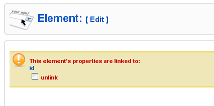
To disable the parent/child relationship click on the "unlink" check box. The usual edit element form will fade in and when you save the element, it will no longer be linked to the parent element. Once unlinked the child element can not be linked back to its parent element.
To edit the parent element, click on its name. In the example above that's "id"
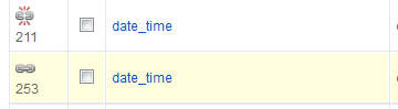
In the table view parent and child elements are indicated with a unlinked chain icon (the first icon in the image below) or a linked chain icon (the second icon in the image below). Clicking on the linked icon will allow you to edit the parent element.